
.avif)

Introduction
Grids add functionality and aesthetics to your designs. They allow you to make your content, be it type or media, on a website look more organized and cohesive. Webflow Grids will aid in achieving the required visual hierarchy and balance to your Layout.
Webflow eliminates the need to remember the dozens of properties of CSS grids and allows for a more intuitive and visual way to build Grids in Webflow. Furthermore, it's easy to resize and reposition elements easily to build Webflow responsive grid layouts.
This blog covers all about how to create a grid and add content that looks neat and comprehensible while ensuring your design adheres to all breakpoints.
Let's begin with the basics.
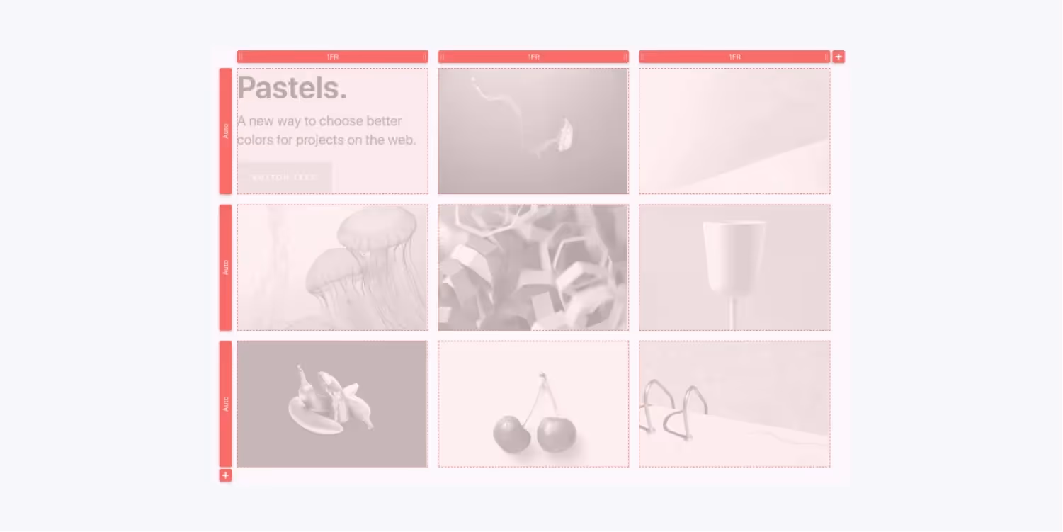
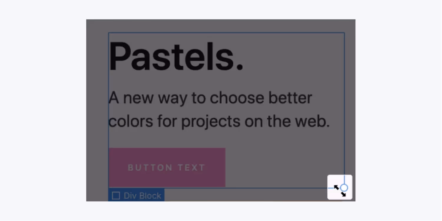
Create and edit a grid
- Create a grid
The first step is to create a Webflow grid. Two ways to do so are -
1. Go to Add panel and select the Grids Webflow element listed under the Layout,
2. Go to the Style Panel on the right and apply the grid to display settings under Layout.

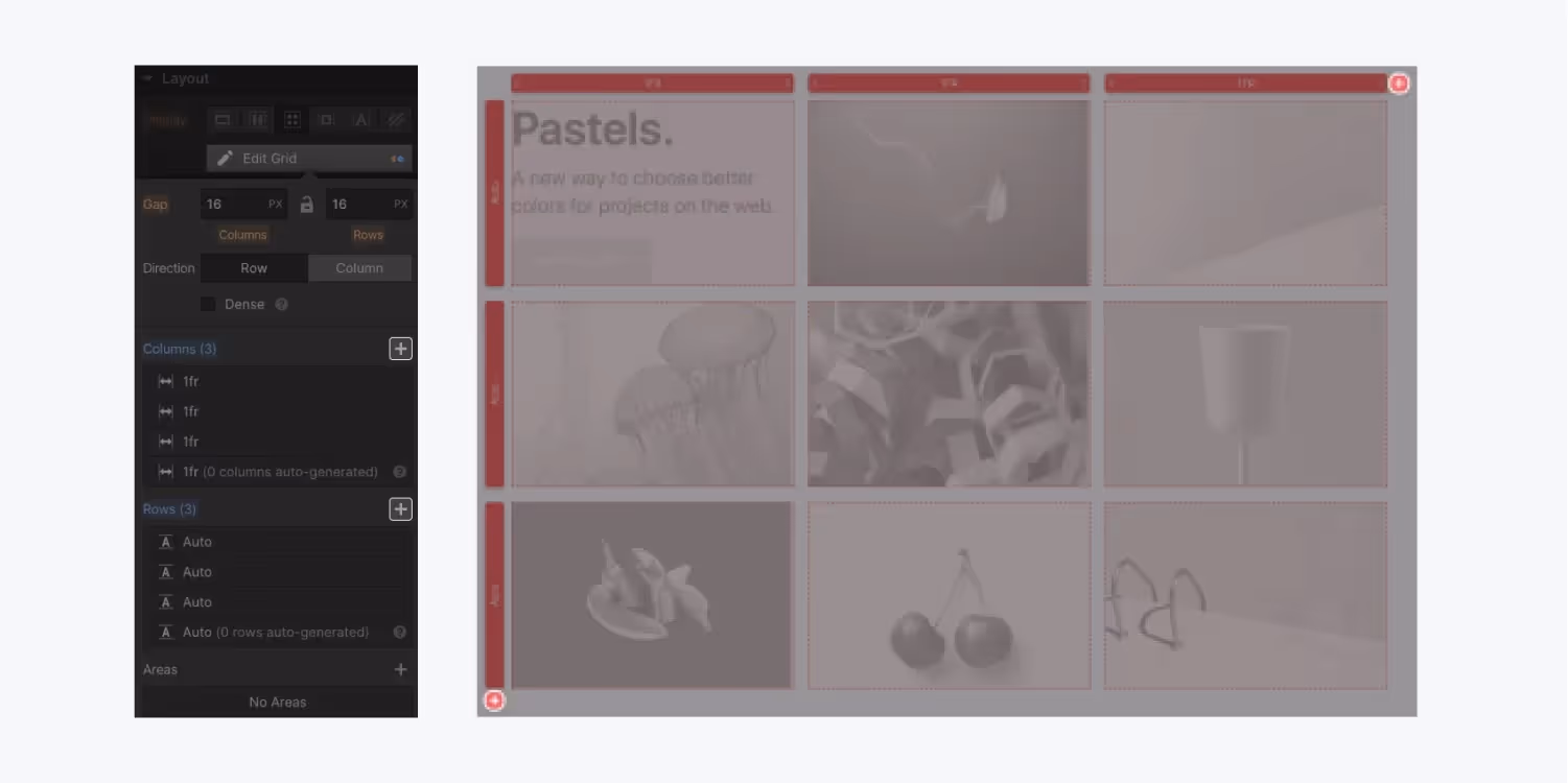
- Edit Grid
Select the grid you want to modify. Click on the Edit Grid button under Layout of the Style Panel. After you're done with editing, click Done on the canvas or press the ESC key.
- Add column/rows
You will see two Add buttons on either end of the grid on the canvas with red plus icons. You click the icon on the top and bottom to add columns and rows, respectively.
Alternatively, you can do the same with the Add button in the Style Panel.
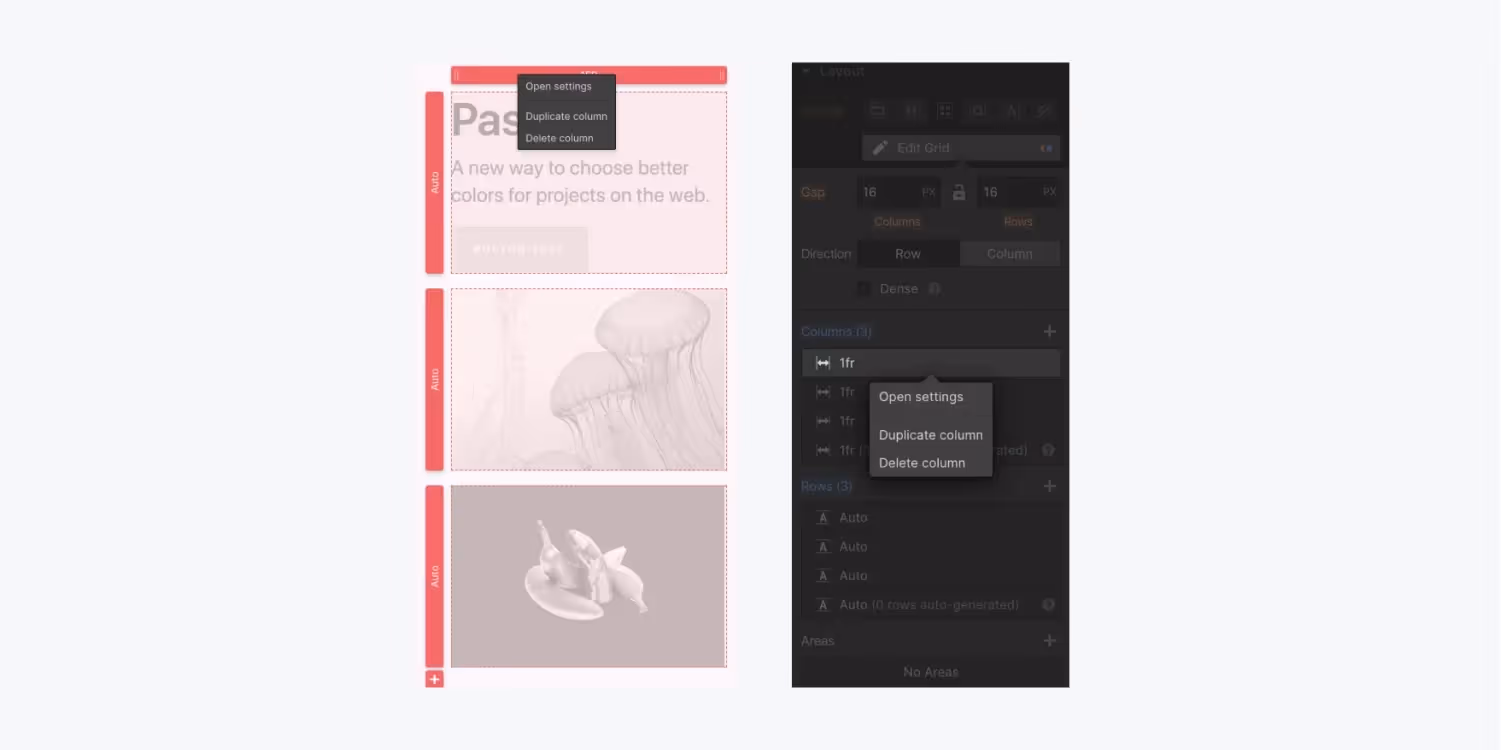
- Duplicate and Delete
Within the canvas, right-click the column or row you want to delete or duplicate.
Otherwise, you can do the same in the Style Panel by hovering on the desired row or column.
- Reorder
An easy way to reorder the rows and columns is to reorder them in the Style Panel. When you hover a row or column, a handle will appear. You place the handle where you want to place your row/column.
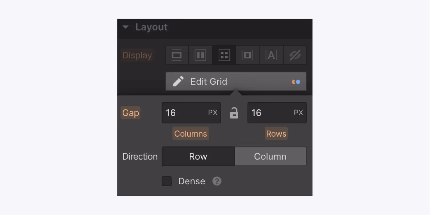
- Adjust Gaps
You can introduce gaps between your rows and columns without the use of padding and margin in Webflow. You simply drag the gap visually in the Canvas.
Again, you could do the same by defining Gaps in pixels in the Style Panel.
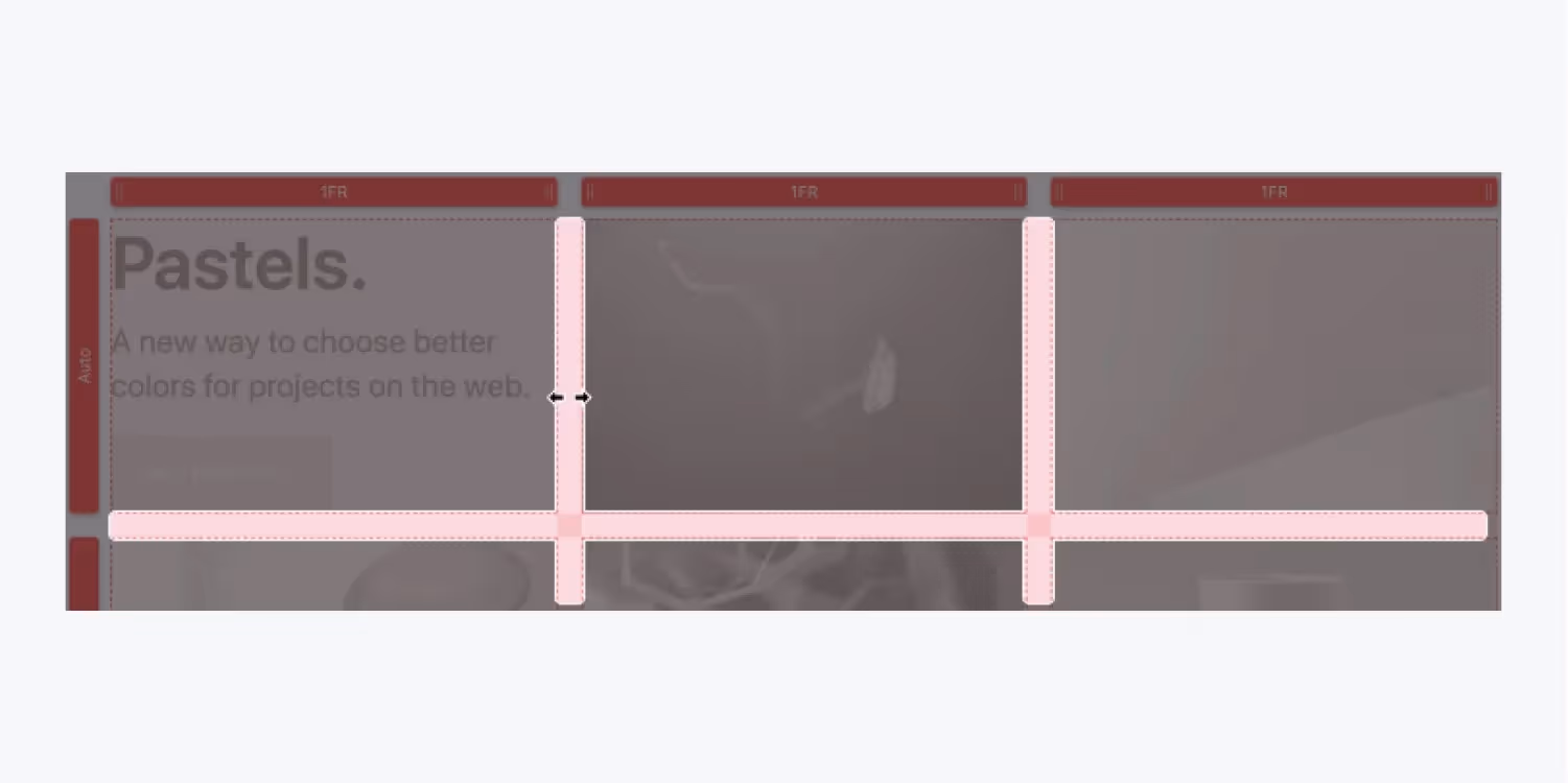
- Adjust sizing
To adjust the sizing of the columns, you click and drag the column heading.
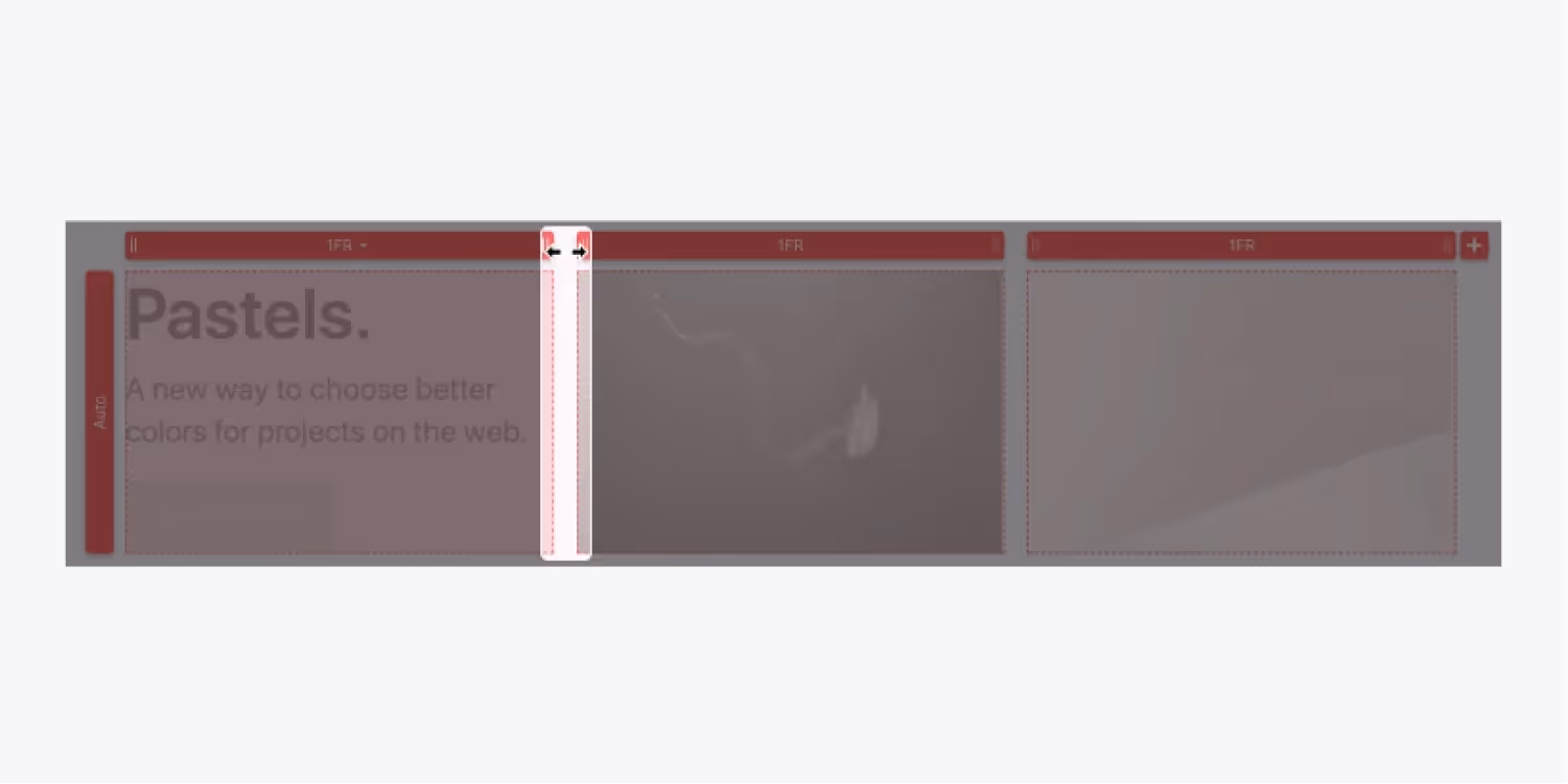
You can also add custom sizing for both rows and columns in the Style panel.
- The FR Unit
We usually use FR units for measurements instead of pixels and percentages. FR represents the fraction of the total space that a row or column can take up.
For instance, four columns of 1FR each will occupy 25% of the available container space.
When you add/delete 1 column, the remaining ones will automatically scale up/down to fill in the gap. You need not calculate the sizing and reapply them to each column manually, as you do for pixels or percentages.
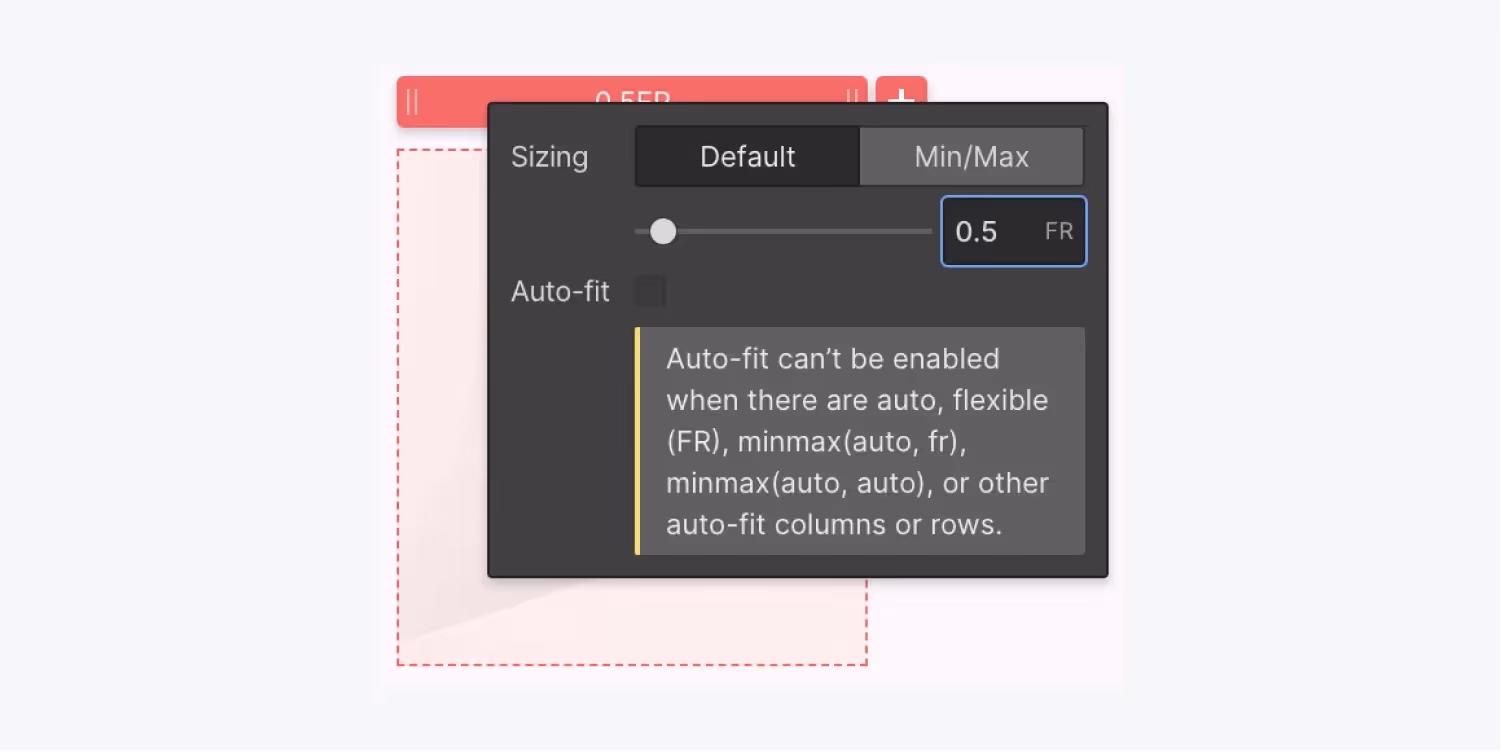
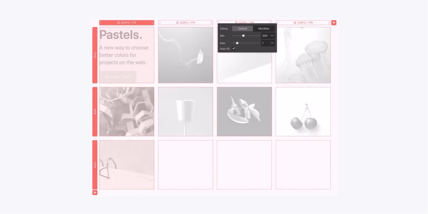
- Min/Max Settings
Min/Max settings set a threshold value for how much your rows and columns can shrink or expand. For instance, if your min settings for a row is 300px, even if you delete everything that row contains, the row will still have a height of 300 px.
You can assign these values manually or set them to Auto in the Style Panel under the heading of rows and columns.
Place content in a grid
You can place anything in the grid, like a div block or another grid. Each new element you add will act like a child element of the grid and will automatically go to occupy a new cell in the default direction flowing from left to right.
If all the cells are occupied, the new child element will occupy a new row.
- Control direction
The default direction of flow in which elements occupy cells is left to right. But you can override this by changing the direction from top to bottom by selecting the column in the direction settings in the Style Panel.

- Manually position content
Besides setting the direction to rows and columns, you can also place an element manually. Suppose you want to place an image in the center cell of the grid. You press Shift while dragging it and place it in the desired spot.
You can also change the position of the child grid element by setting the position to manual in the Style Panel.
Nesting
You can also nest elements in Webflow grid areas using containers in the grid cells to hold multiple elements. For instance, you can use layout elements like a Div block to contain images, headings, paragraphs, and more.
Once you have added the Div, you now hold the CTRL key while dragging different elements from the Add panel in the Navigator.
- Duplicate content
You can reuse the content from one cell into another by duplicating it. The two ways to do so -
1. Drag the content you want to duplicate and move into the designated cell while pressing ALT (Windows) or OPTION (MAC).
2. You can select the content and copy it. Then select the grid and perform a simple paste.
Move, span, and align grid content
Adding content to the grid is not enough to create a responsive or visually appealing design. You need to manipulate the content inside the grid to use grids effectively. Here's what all can be done within grids -
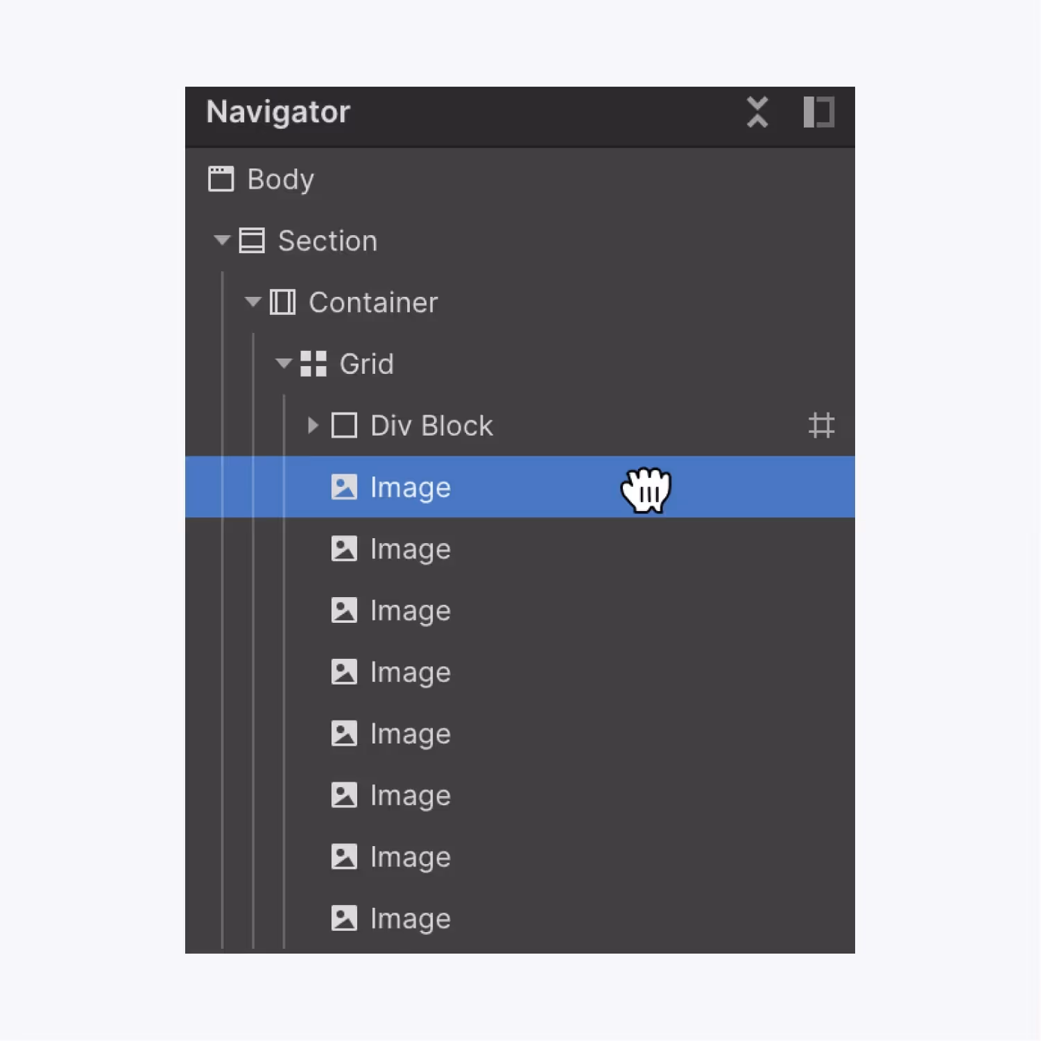
- Move grid children
You can move grid children using Navigator. More so, reordering the grid children in the Canvas will also affect the Navigator.
- Reorder grid children
Alternatively, you can also reorder grid children under Webflow grid areas in the Style Panel under Grid Child Settings.
- Align content
You can align content for the entire grid at once or the individual element.
For grid
Select the grid and change the alignment in the style panel.
For child element
Select the grid child and then go to Alignment settings in the Grid child settings and set the desired alignment.
- Webflow Span grid children
You can span a child element to occupy multiple cells. Select the grid child and expand the handles you see on the selected child.
Alternatively, you can span elements in the style panel.
If the position is automatic, specify how many rows and columns the child should occupy.
Otherwise, for manual positioning, you have to specify the start and end rows and columns for the element.

- Lock grid child positioning
The grid gives the power to automatically scale according to the layout changes. However, in certain cases, you would want the child element to stay put in their position. For example, you will not want your footer to remain at the bottom end regardless of the number of rows you add.
You can achieve this by locking grid child positioning by assigning negative values. Negative values use a reference from right to left and bottom to top.
So, in the example above, you need to position your footer at -1/-1 to keep it rootedat the bottom of your screen.
- Clear grid child settings
Grid child settings indicated in the pink colored label apply to the selected child element at a given breakpoint instead of being inherited from the class. These settings cascade at lower breakpoints and are then indicated by an orange label. They will turn pink again if you override the settings at lower breakpoints.
You can go to Grid Child Settings and revert to the original settings by clicking Reset.
- Overlap grid children
Grid children in the same cell will overlap each other if set to manual positioning. You can control the stack order of these elements by structuring them in Navigator or modifying their z-index.
- Fill empty grid cells.
If you span grid children, chances are, you will find an Webflow grid first cell empty. In order to automatically push content in these empty cells, you need to select Dense settings in the Style panel.
Dense settings are not recommended because they negatively impact accessibility. The cells are filled only in the display, while the source layout remains the same.
Design a responsive grid
With dozens of screen sizes to cater to, Webflow grid responsive designs are a must. So, if you are wondering how to make grid responsive in Webflow, there are two main ways to achieve this:
- Manual styling
You view your grid across screen sizes and manually remove columns on breakpoints.
In case you can't delete columns, you can try one of these -
1. Change your grid direction to row.
2. Avoid manual positioning for any grid children in those columns
3. Avoid child elements spanning those columns.
- Enable auto-fit
Webflow grid auto-fit aids in automatically accommodating the columns as per the screen size. You don't have to check each breakpoint manually.
You will only keep a single row and column and delete the rest. Then you set the minimum and maximum dimensions for the remaining column and enable auto-fit. Now the columns will automatically repeat and wrap, giving a responsive design.
Conclusion
Grids are dynamic layouts that can contain anything literally. Webflow brings the power of CSS grids on a visual canvas. It's possible to create and edit the grid and manipulate content and grid Layout with simple drag and drop.
Suppose you're looking for a team of professional partners who can build responsive websites and web applications to drive your business growth. Our clients have the perfect recommendation for you. Check out what our clients are saying!


.png "Schedule a call with Workshore Webflow agency")