
.avif)

Webflow Sliders are an excellent way to demonstrate testimonials, product features, product variants, and such. In addition, they offer captivating visuals for retail, tourism, portfolio, news website, etc. But, the question is how to create sliders in Webflow.
Webflow offers a straightforward way to include sliders in your web designs. Additionally, thanks to Webflow's visual builder, you can customize the Webflow image slider up to pixel precision. Adding interactions and animations is easier than doing so in traditional web technologies.
This blog covers a simple Webflow slider tutorial on what and how of Sliders in Webflow. Read on to find more.
Anatomy of a Slider

The Webflow slider has four components or children -
- The Mask contains two slides by default.
- The Left Arrow
- The Right Arrow
- Slide Nav or the slider navigation represents our position in the slideshow webflow carousel.
How to Add Slider in Webflow
You can add a slider in Webflow by dragging and dropping a slider from the Elements panel into the page. The slider will occupy the entire width of the parent elements it's dropped in.
Besides the two slides that we already have, you can add more slides. Then, you can either duplicate the existing slide by right-clicking the slide. Or, select the slide in the Navigator panel and perform copy-paste on the slide.
A third way to add a slide is via the Element Settings panel in the right sidebar. You can select the button - Add more slides in the Slide settings tab.

You can access all the slides on the page by clicking the slide nav and via the left and right arrows. Or you can also use the arrows in the Slider settings.
Edit a Slider
After adding as many slides as required, it's time to edit them. Sliders like Sections can contain other Components like paragraphs, buttons, or containers. Therefore, sliders make an excellent option for holding images, videos, and content.
Here's how to do it.
Adding Background Image
You can add an image element to the slides. However, that doesn't offer us proper control, like adding content on top of the image.
So, we will begin by making a class for the slider and then adding a background image. Now, you can start editing the image. First off, turn off the tile settings. The size of the image can be set in pixels. Or, there are two other smarter solutions -
Contain: The image will fit entirely into the slider without being cropped so that we may have a space around the image.
Cover: The image will cover the entire slide width, and it might get cropped from the corners to fit the aspect ratio.

You can change the hierarchy of a slider Webflow by moving it upwards/downwards on the Navigator Panel. In addition, you can edit the slider to behave like a section and occupy 100% of the viewport if you want it.
Adding Content to Slider
You can start off by adding a container to hold all the content correctly in the slide. Then, you can add headings, paragraphs, buttons, and images. You can add combo classes to each slide to modify the styling properties and content. You can copy and paste the container from the first slide to another slide, to build upon existing designs.
You can copy and paste an element from another project to your current page using CTRL+C and CTRL+V for Windows or CMD+C and CMD+V for MAC users.
Apply Settings
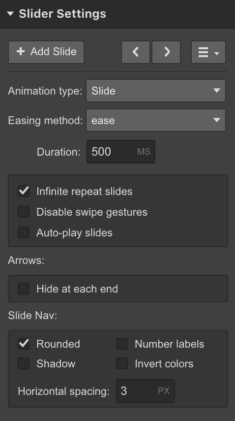
You can edit the settings in Slider settings to control how your slides behave.
- Animations: Configure the animation type to set how slides will appear when in motion.
- Easing Method: Set how slides transition by changing the easing method
- Duration: Set the time the slider takes to jump to another slide.
- Swipe Gesture: Control your slider's behavior on touch devices by turning on/off the swipe gestures.
- Autoplay: Set the time lag after which the first slide should change into the next without the user's input. Control when the slider stops displaying the next slide on the loop.
- Hide at each end: Hide the left arrow on the first slide and the right arrow on the last slide for a more intuitive user experience.
- Slide Nav: Change the size, shape, and color of the Nav buttons.
Customize Slider
You can customize the slider for enhanced customer experience and visually appealing interface. These are the customizations available.
Resize the slider
You can resize the Webflow multi image slider by editing the viewport height. In addition, if the background image is set to Cover, it will resize accordingly.
Alternatively, you can change the parent element so that slider resizes to fit the parent element.
Customizing arrow icons
You can customize the arrow icons by turning them into class. Then apply settings to the class and edit the font color and font size to best suit your needs. Now, apply the class to other arrow icon elements as well.
Replacing arrow icons
Within the left or right arrow elements, delete the icon element. Now, you can drag and drop your chosen image into either of the arrow elements to get a custom arrow icon.
You can also set a hover image for your left and right arrow icons by using Filters or changing the opacity.
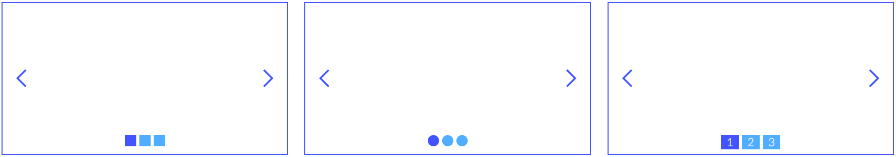
Styling the Slide Nav dots
You can alter the size of the dots or number labels by changing the font size. To change the color of the dots, you have to embed custom CSS into your code -
Consider,
.w-slider-dot is the class of dots, and
.w-slider-dot.w-active is the class of active dots.
<style>
.w-slider-dot {
background: blue !important;
}
.w-slider-dot.w-active {
background: navy !important;
}
</style>
Similarly, to edit the shape of the custom Nav dots, you need the following CSS code
<style>
.w-slider-dot {
background: blue !important;
}
.w-slider-dot.w-active {
background: navy !important;
}
</style>
Change the color of the dots using the following embedded CSS code
<style>
.w-slider-dot {
background: #4353FF !important;
border: 3px solid #4353FF !important;
}
.w-slider-dot.w-active {
color: #4353FF !important;
background: none !important;
border: 3px solid #4353FF !important;
}
</style>
Here’s how the output will look like:
Hiding slide elements
You can also hide slide elements. Select the element like arrows and change the display settings to None.
If you want to turn the dots into squares, you can go to slider settings, then to the slide nav section and toggle the rounded settings to off.
Show multiple slides at once
Webflow slider show multiple slides to make it a carousel slider.
You can also display multiple slides to make it a carousel slider. You can do so in the following steps -
- Add a slider
- Create the same class for all slides
- Set the width of the slide to 33.33% to show three slides on the desktop.
- Set the width to 100% to show three slides on a mobile screen.
- Customize each slider by adding a unique combo class
Using Collection Items
Sliders can't use dynamic data. However, you can use Collection lists to populate sliders.
- Connect the first slide to the Collection list.
- Limit the items displayed on the Collection list to one.
- Duplicate the slide and change each corresponding slide's "Start at" number.
- Now, your slide 1 corresponds to 1st item, 2nd slide corresponds to 2nd item in the Collection list, and so on.
Conclusion
We have covered everything you need to know about creating interactive sliders for your web projects.
However, designers must note that sliders must be usable and accessible. The users operating through the keyboard or voice input software must be able to interact with the slider. Plus, users must be able to pause sliders to read text, if any.
The space they occupy must not disrupt the user experience, which often happens if the sliders are inserted for the sake of it instead of evaluating their need objectively.
Are you unsure of how to create usable and accessible web projects?
We have created several such exciting web solutions in the past and will be happy to help you too. You can always talk to us.


.png "Schedule a call with Workshore Webflow agency")